Mann schreibt mit Stift Notiz in Notizblock

Projects

Daniel und Patrick in einer gemeinsamen Strategischen Besprechung vor dem Laptop im Meetingraum der Agentur

About us

Design und Development in einer strategischen Besprechung in der Agentur

Let's meet

Webdevelopment am Bildschirm mit Programmiersprache

Digital Product Design & Web Development

Mit einem Stift wird ein neues Strategisches Konzept auf das Flipchart übertragen

Digital Transformation & Automation

AI-Integration & -Training

🚀 From Zero to AI Hero: Discover the world of Midjourney in our latest webinar!

Branding, Website & Editorial Design

alexandria

As a stage for scientific articles, the young science magazine alexandria represents a counterpoint to dangerous half-knowledge and unsubstantiated exchanges of opinion: These are replaced by fact-based discourse. The aim is to make knowledge understandable and accessible to everyone, without having to dispense with the guidelines of scientific work.

Both on the web and in the print magazine, these values, which are an essential part of the brand identity, are to be communicated visually. (Hero image: © Robert Puteanu)

  • Art Direction & UX Design: Anna Steinacher

  • Development: Daniel Huber

  • Graphic & Illustration: Lena Kralicek

  • Project Management: Patrick Kofler

  • Webdesign & Development

  • Branding & Design

Away from the design language of dusty journals and articles, but without losing the seriousness of a scientific publication - that was alexandria's briefing.

The character of a journal was not to be completely lost, but reinterpreted by the magazine. The brand should be consistently reflected in the print magazines and on the website, where articles are also published.

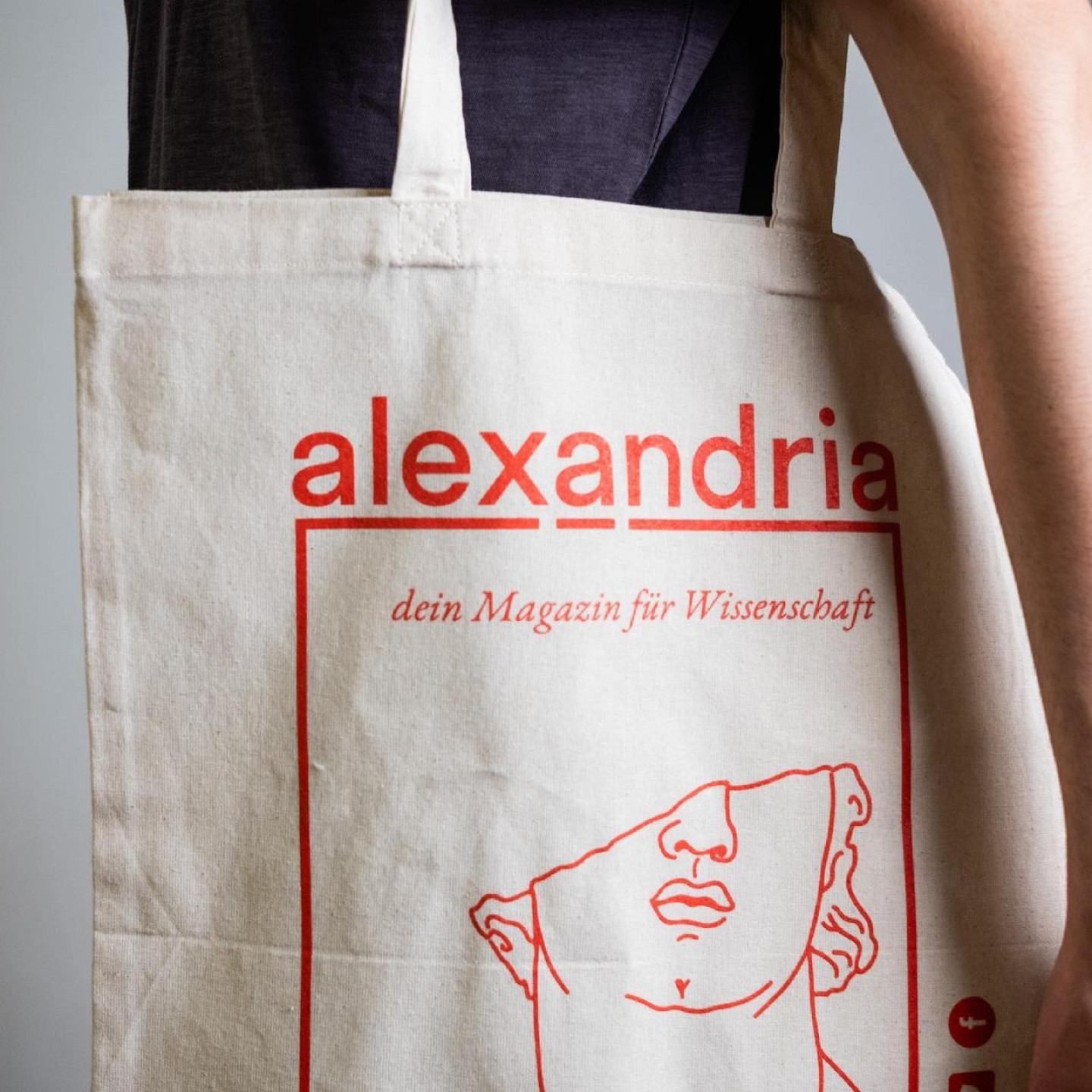
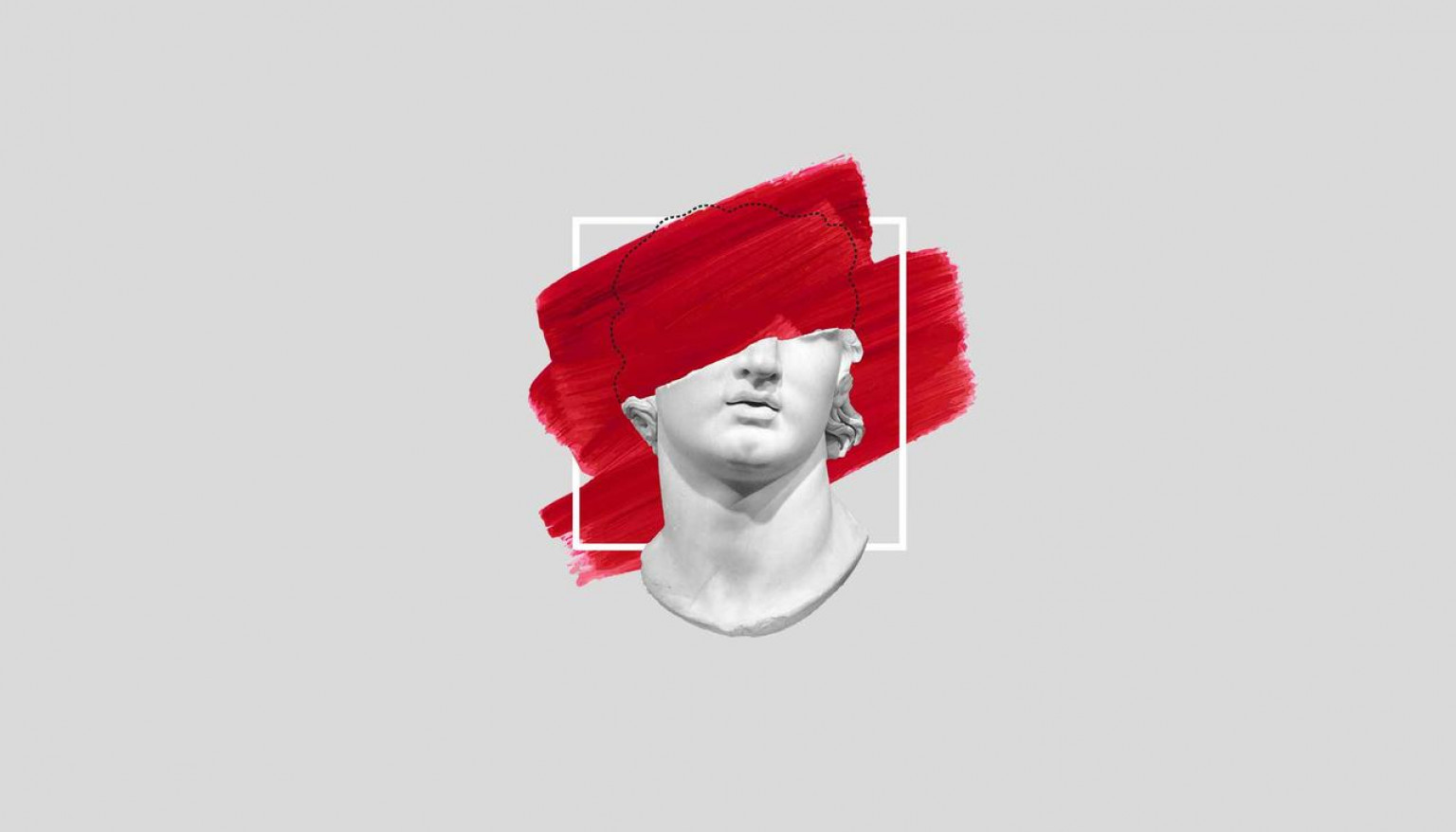
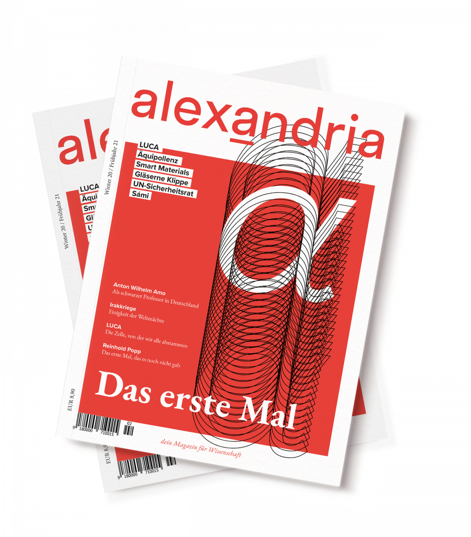
The motto "Full knowledge instead of half-knowledge" is not only highly relevant to the content of the articles, but also represents an inherent brand component. The name of the magazine pays homage to the important ancient library of Alexandria: This antique character is also taken up in the branding, complemented by black and white photographs, and undergoes an exciting reinterpretation through the combination with modern elements. 

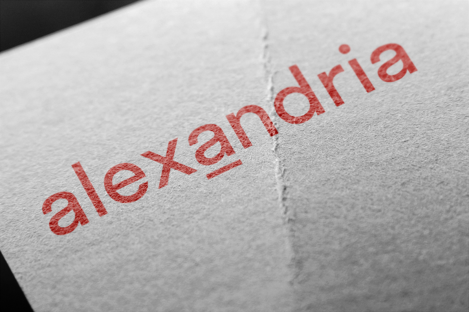
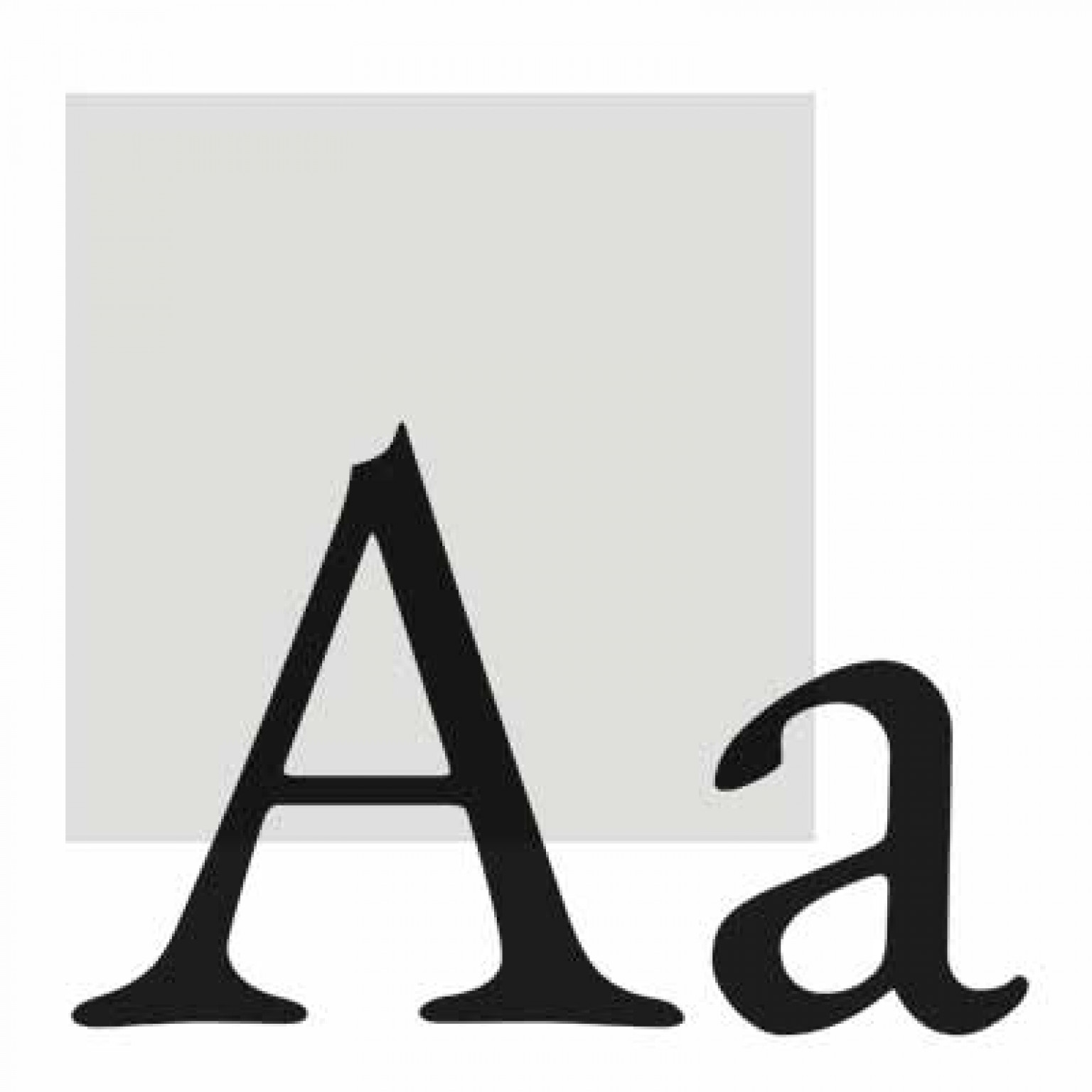
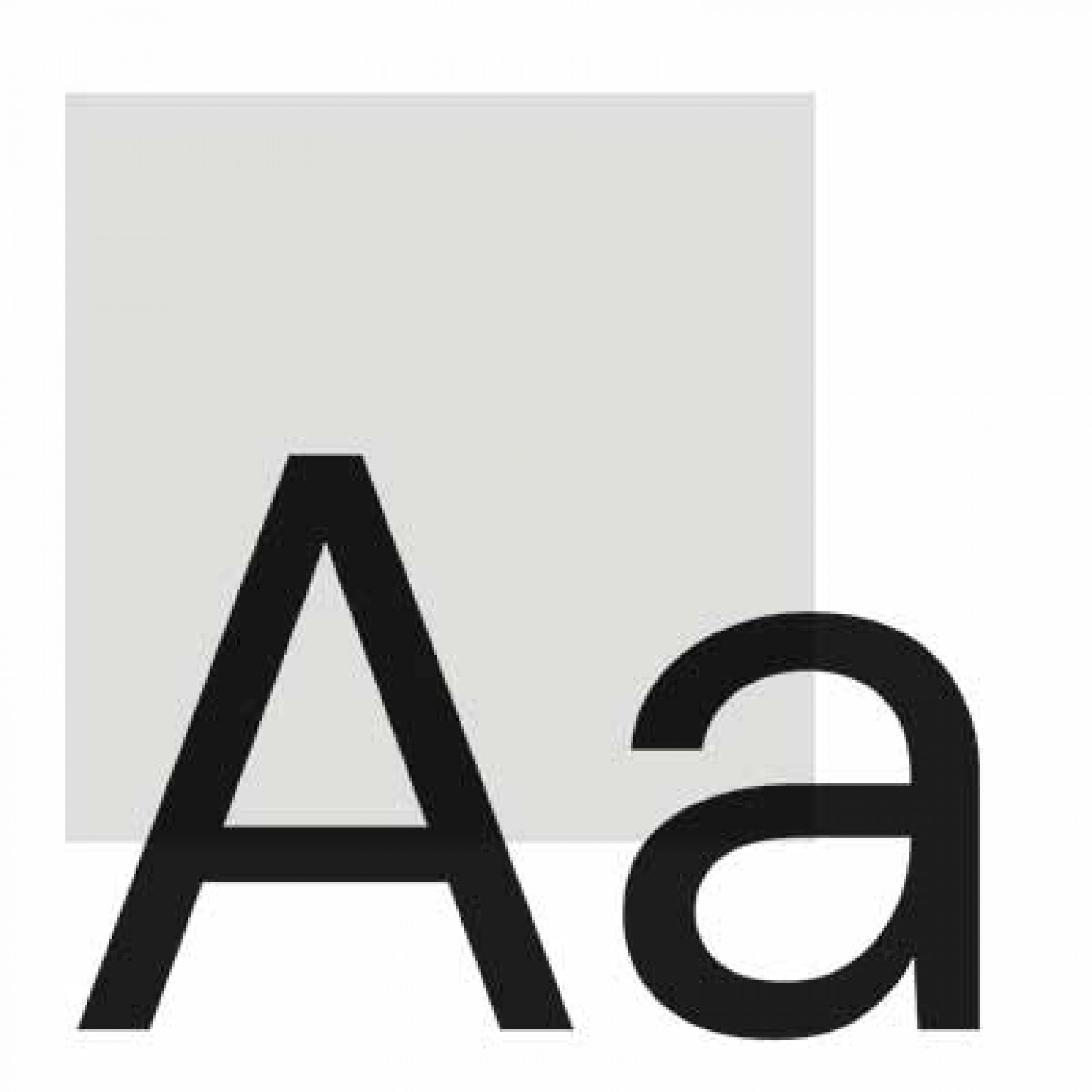
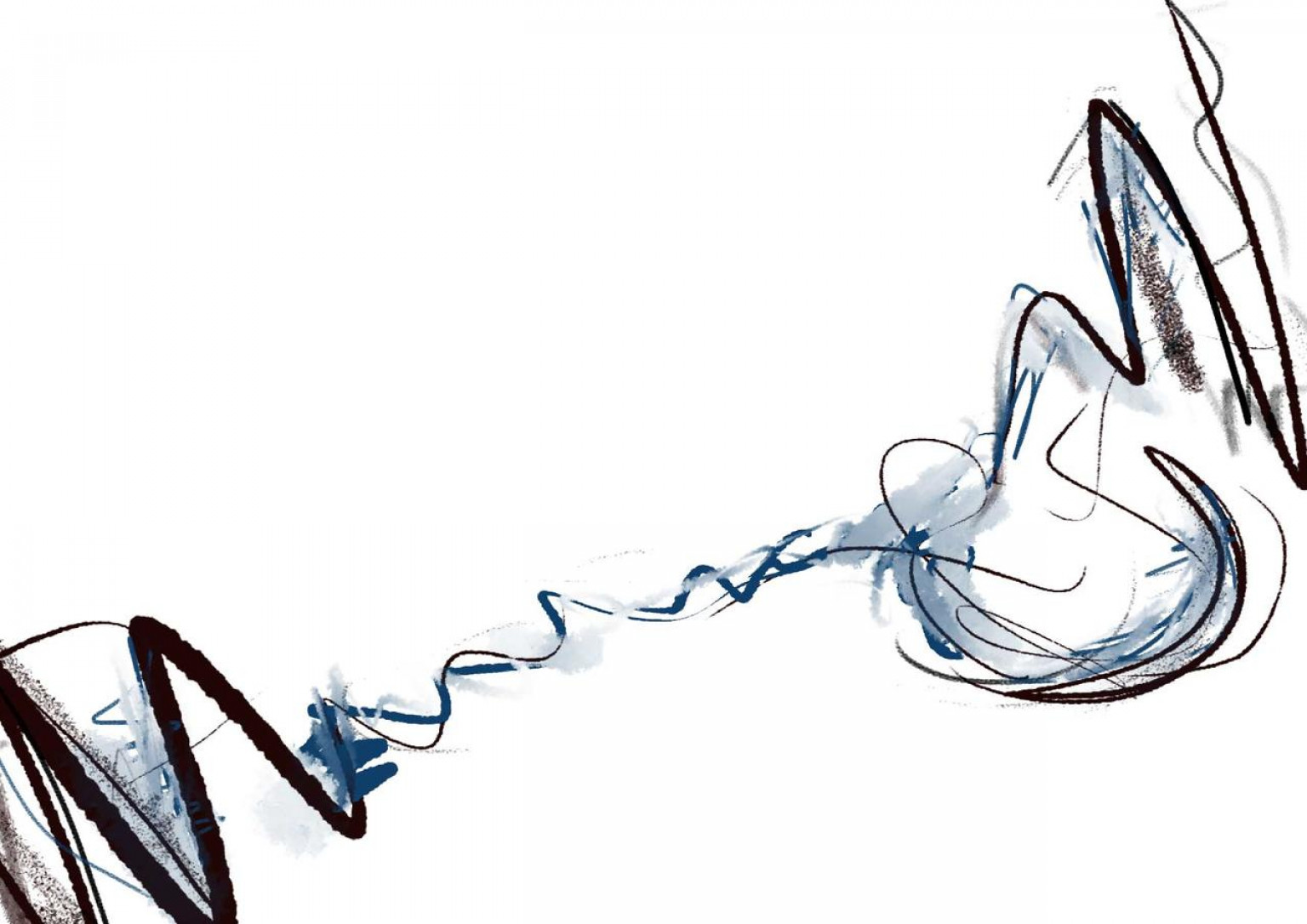
The easy comprehensibility of the content is reflected in the typographic design of the magazine: a clear sans serif typeface meets a classic serif typeface often used in journals. The color palette is composed of a noble, dark blue and a fresh, lively red.