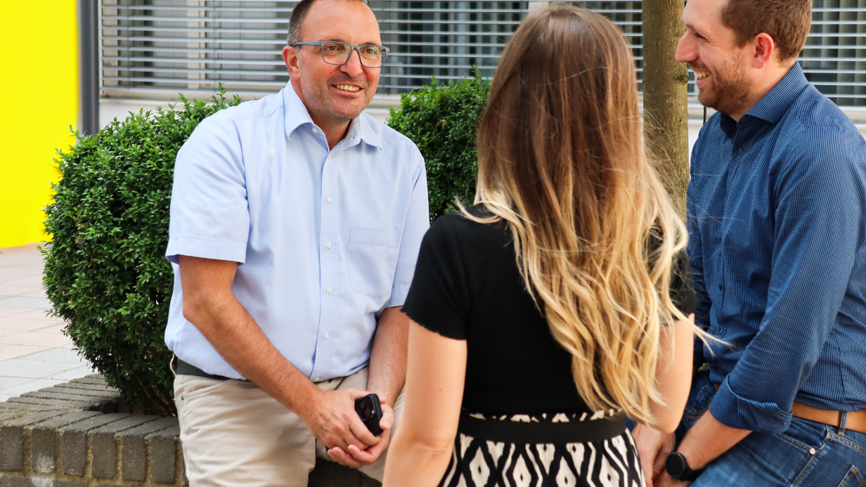
The German University as a distance learning university is the epitome for the comprehensible transfer of knowledge, sustainable and personal growth and stands for a high modularity and flexibility of the courses.
Art Direction: Anna Steinacher
Branding & Design: Anna Prischink
Project Management: Anna Prischink
Branding & Design
Logo Design
The German University pursues the goal of quality leadership for distance learning programs. In order to achieve this, it is essential to present a serious image to the audience, which on the one hand radiates the highest level of competence and on the other hand modernity. The corporate design immediately conveys to the target group that a degree from this online university is equivalent to the quality standards and demands of established institutions. The German University stands for sustainable studying in the sense of an optimal preparation for the future career of the students.
The logo, typeface, design language and color scheme combine the digital approach to studying with the tradition and image of established universities. An elegant serif font of the logo and a noble dark red color underlines the standards of the university and gives it a certain exclusivity through the choice of colors. At the same time, the logo is complemented by delicate, linear and minimalist shapes that express the modernity of the distance learning university.
The key visual, which stems from the idea of connecting the digital university with the analog world, represents a bird - the heraldic animal of the city of Potsdam - the physical location of the university. With the new brand identity, which is in no way inferior to that of established elite universities, the values of the German University are thus perfectly embodied.


